
In honor of Mary Shelley’s birthday…
I was initially intrigued when I found out Guillermo del Toro would be directing last year’s Frankenstein, since he did so with the goal to minimize CGI and incorporate more handmade sets.
So, I thought I’d delve into what I thought this adaptation did well and what I think were some weaknesses in the representation.
Likes:
- The color red. Like the great M. Night Shyamalan, the director used red throughout the film as symbolism surrounding Dr. Frankenstein and his relationship with his mum.
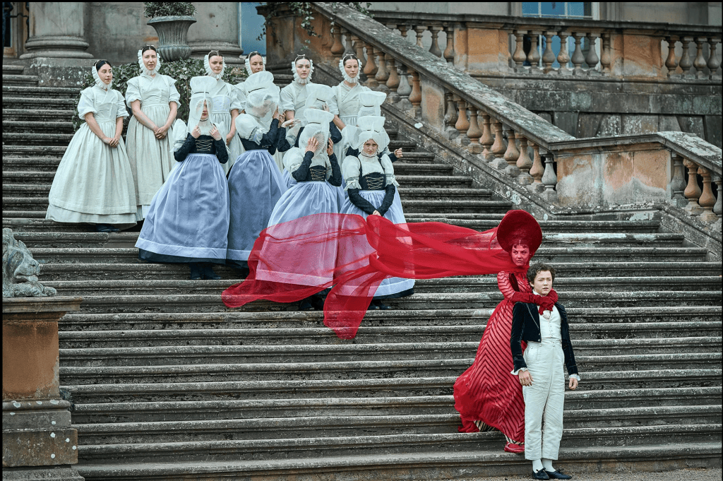
- The relationship between Doctor Frankenstein & The Monster. The Monster’s personality and traits paralleled the book very accurately and I like that they portrayed Doctor Frankenstein as more inhumane than what he created; showing that the monster he created was himself.
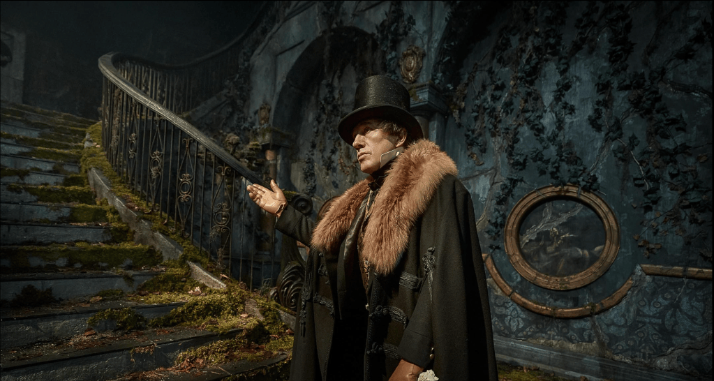
- The aesthetic. …Because, of course!
Dislikes:
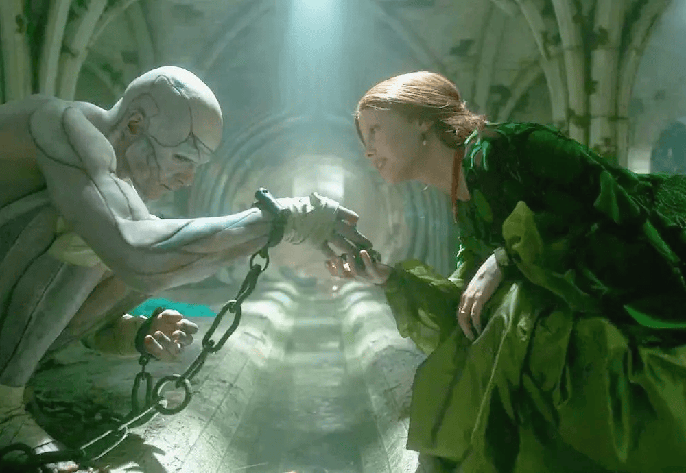
- “Hot Frankenstein” Trending. Wasn’t too thrilled that they went the way of the physically fit and handsome monster, but I won’t hold it against them.
Overall, I think Shelley wouldn’t be too disappointed in this adaptation of her work. I’ll have to watch it again soon!
Discover more from W. M. Ashley
Subscribe to get the latest posts sent to your email.
